The brutal images coming out of Ukraine remind us of Schindler’s List, and a bit of dialogue from that movie. Oskar Schindler is ruminating on his success, which came late in his career: “Something was missing…It makes all the difference in the world between success and failure: war.”
It is said that the market climbs a wall of worry, and among all the things there are to worry about–rising interest rates, inflation, food shortages, supply chain interruptions–many investors are deeply worried about the war in Eastern Europe. Will it spread? Will NATO become involved? Desperate people do desperate things, and things in Ukraine have gotten desperate for both sides.
Bulls and bears love to argue, and the argument seems to come down to this: the bulls say war spurs economic growth, and therefore leads to stock market increases. The bears say war impedes trade, and therefore leads to stock market declines.
Was Schindler right? Have wars been good for stocks? Luckily, but sadly, we have a ton of historical data for reference:
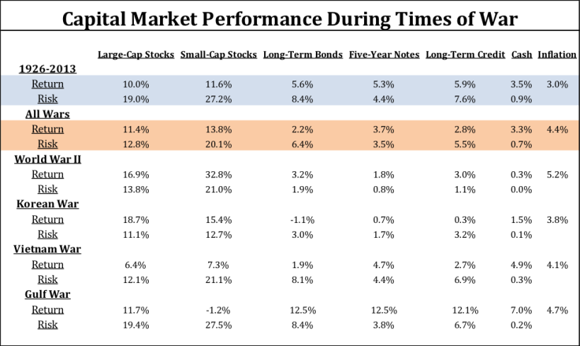
We can see from the chart above that wars have, in fact, been good for stocks. Not only have returns been higher during wartime, risks have been dampened as well. Lower volatility coupled with higher returns are typically welcomed by most investors.
It’s notable that wars, at least insofar as this chart is concerned, are also periods of higher-than-normal inflation. We can hope that this situation in Ukraine does not expand to include the direct participation of the US, but if it does it seems likely that it will be coupled with rising prices.
It is also notable that bonds underperformed during war time. We suggest that this is linked to that higher inflation–the two have generally been negatively correlated. Wartime government borrowing tends to drive yields up, and prices down. With or without war, investors should be aware of these patterns, which may not be intuitively obvious.
While we do not recommend making allocation decisions based on short term market moves, it is worth noting that the S&P 500 has been positive between February 20th and April 18th, and recovered much of its YTD losses. Keeping in mind that we can never reliably predict the future, the war-is-good-for-stocks meme seems to be holding true.
Real Estate: Is the Long Bull Run in Residential Real Estate About to End?
According to The Federal Housing Finance Agency, home prices rose 18.2% across the USA between January of 2021 and January of 2022. If you own a home, you have to feel pretty good about that.
Almost two-thirds of Americans families own a home, and while we have only anecdotal data, we suspect that among stock market investors that number is much higher. If you are a homeowner, you might love this chart at first glance:
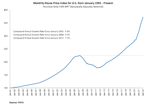
“Endpoint sensitivity” and “recency bias” both refer to human behavior. In a nutshell, both refer to the natural tendency to give greater importance to the most recent events. In practical terms, that means that the Great Recession has all but faded from memory for many people, but the run-up in home prices over the past ten years is top-of-mind.
One of the great things about decades-long historical charts is that we can see what economists call “full cycle” results. A full cycle is a period that includes both bull and bear markets. Let’s take a closer look inside the numbers on the chart above.
The compound annual growth rate for home prices in the USA between January 1991 and December 2021 was 4.3%. Here’s a fun fact: according to Vanguard, the return on fixed income between 1926 and 2019 was 5.33%. That’s right: those data demonstrate that bonds overperform home prices over long periods of time.
Home prices did much better from January of 2012 through 2021, averaging a 7.7% annual growth rate. January of 2012 was roughly the trough of real estate prices following the massive selloff that began with the Financial Crisis. That means the peak-to-peak period–the time from sell off to full recovery–was ten years. Economists refer to that period on this chart as a “soup bowl”.
No bear market in the S&P 500 has ever taken ten years to fully recover (the longest recovery on record was 61 months).
So what does all this mean? As always, we must first stress that we don’t know. But we do think that it’s reasonable to incorporate some of this information into our long-term planning, and here are a few things to think about:
What goes up must come down. The nearly vertical line in home prices over the past few years seems ready for mean reversion. Can a market with a forty-year pattern of 4.3% returns sustain 18% growth year after year? Can you think of a marketplace that ever has?
Doesn’t the chart seem awfully symmetrical? If we think back to the period before the Great Recession, don’t we remember a big run-up in home prices, very similar to the one we’ve enjoyed recently?
On April 18th, Bankrate said that the national average of 30-year mortgages was 5.25%, double what it was four months ago (2.73%).
With the most recent CPI at 8.5%, is it likely that interest rates will continue to rise, and if they do, is it likely that the total cost of homeownership will rise with it? Might not home prices fall in response to those rising finance costs?
Again, we do not know. But we suggest it may be prudent to consider a couple of things:
Plan on less liquidity for your home. We may be entering a period of softness in the demand for homes (existing or new). If you’ve been planning on using the equity in your home, you should consider what this may mean for you.
Comprehensive financial plans typically contain a forecast of growth for your home’s value. Likely your home has been overperforming that forecast for the past several years. Now may be a good time to revise those forecasts downward to see how that changes your plan, and possibly your spending, saving, and investing behaviors going forward.
Taxes First, Then Math™
Whatever Putin may do, or if there will be a recession in home prices, are beyond our control–as so many things are. In our view, this makes controlling the things we can control even more important. Things you can control include the costs of financial services, the tax efficiency of your investments, how carefully thought through your diversification scheme is, and how much downside risk you’re exposed to.
We can help you understand the status of your controllables with a report we call Taxes First, Then Math™. There is no cost or obligation for this report–it’s a part of our service to you.
If you’d like to talk about that, please use the link below to schedule an appointment.